12 Minimalist Black And White Bullet Journal Pages
For those seeking a stylish yet understated approach to bullet journaling, this curated collection of 12 minimalist black and white layouts is sure to spark creativity. By drawing inspiration from these elegant designs, you can easily recreate your own sophisticated spreads.
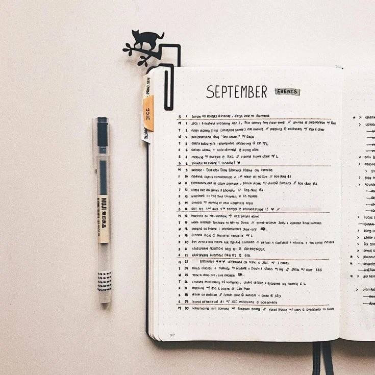
September Events
The planner I’ve highlighted excels at organization, with its clean layout and distinctive brown lines that add a touch of personality. Moreover, the whimsical inclusion of a cat-shaped paperclip is an endearing feature that sets it apart from other planners.
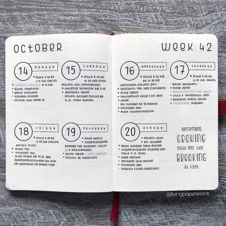
Circles and Dots
The simplicity and elegance of the design are striking, as it beautifully illustrates that minimalism can indeed be anything but dull. The poignant quote ‘remember growing might feel like breaking at first’ adds depth to this thought-provoking spread, highlighting the idea that growth and self-improvement often require a degree of vulnerability and transformation.
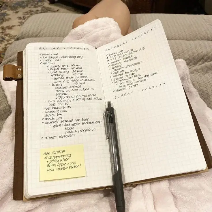
Daily To Do List
In this understated daily planner, you’ll find a dedicated space for your to-do list, where you can utilize your bullet journal key to mark tasks as ‘in progress,’ ‘complete,’ or ‘finished’
Books to Read
Maintaining a record of completed and desired reads is an enjoyable hobby for many book enthusiasts, allowing them to reflect on their literary journey and plan for future explorations.
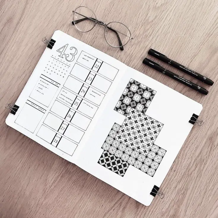
Black and White Patterns
The included minimalist calendar layout is just the beginning, as the spread’s true charm lies in its juxtaposition with the following page’s subtle yet striking black and white patterns. These visually appealing elements work together seamlessly, elevating the entire design to new heights.
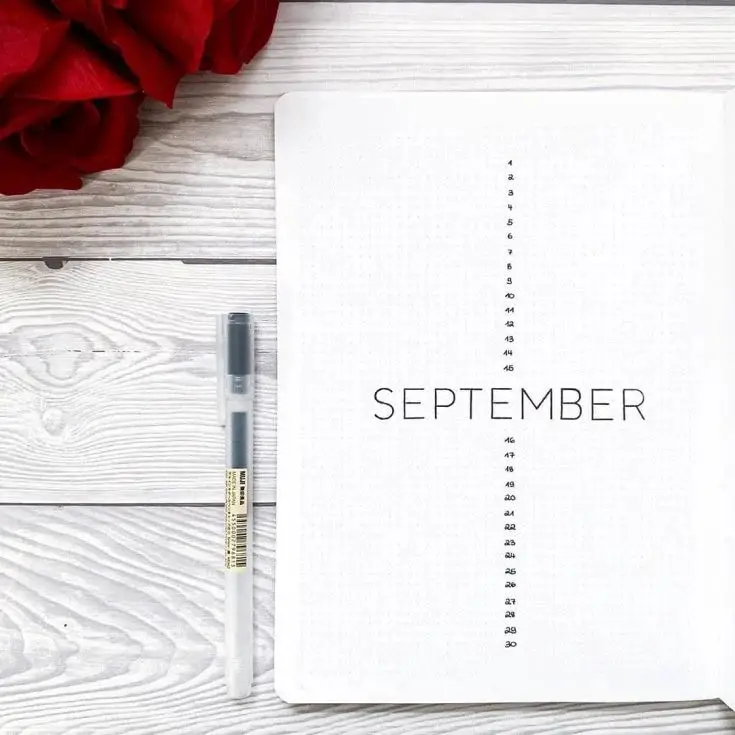
Vertical Numbers
The first thing that caught my attention about this cover page was its unique design. Instead of the typical layout, this one features numbers arranged vertically above and below the corresponding month names. What’s more impressive is how this simplicity translates into creativity, making it a standout among other cover pages I’ve seen.
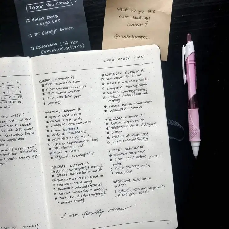
Easy Weekly Planner
With an unassuming appearance, this straightforward weekly planner cuts through the clutter and gets down to business. For those seeking a no-frills solution to stay organized, this page delivers exactly that – a clean slate with ample space to plan out your week.
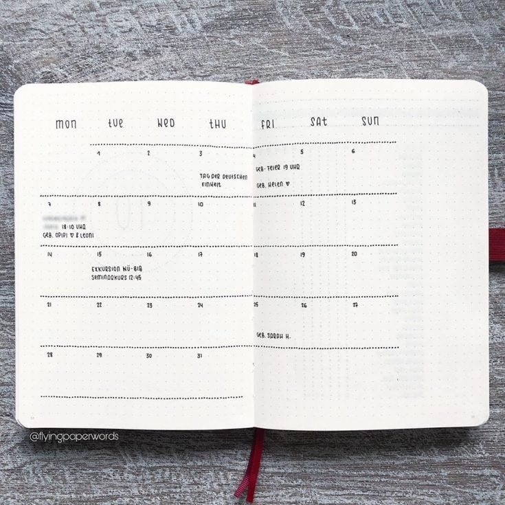
Dotted Calendar
The innovative design of this calendar features a unique use of dotted lines to demarcate each week from the next. While traditional calendars often employ solid lines for this purpose, this particular model takes a more calming approach by incorporating gentle repetition into its layout. The effect is almost meditative, making it an attractive option for those seeking a more serene way to keep track of their schedule.
Bold Black and White
The vibrant design of this bullet journal page truly captures my attention, with a powerful quote that resonates deeply: ‘Together is my favorite place to be.’ This phrase speaks volumes about the importance of connection and camaraderie in our lives.
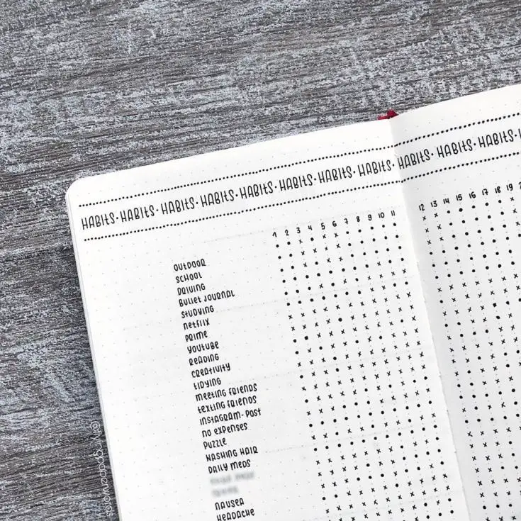
Habits Tracker
I’m particularly fond of a specific minimalist habit tracker that stands out from the rest. Its simplicity and elegance are truly captivating, making me aspire to achieve a level of neatness equivalent to its creator’s handwriting.
Black and White Flowers
The effortless charm of this design lies in its understated simplicity, where delicate, hand-drawn floral motifs bring a touch of whimsy to the overall aesthetic. While it’s easy to appreciate the beauty of these blooms, what’s equally noteworthy is how approachable and achievable they seem – as if anyone with a modicum of artistic ability could create something similar.
Bold and Beautiful
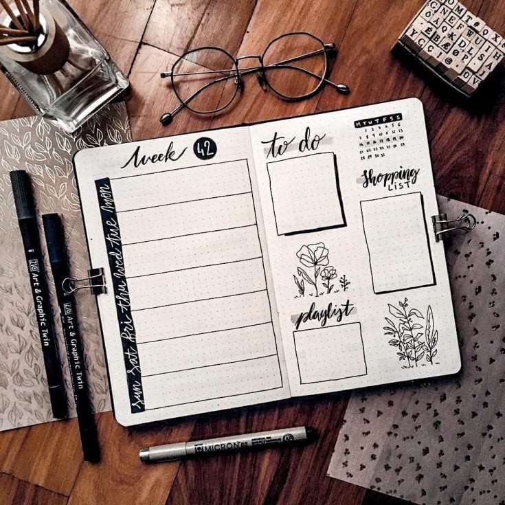
This minimalist spread is a masterclass in bold and beautiful design. By incorporating calligraphy, hand-drawn boxes, and floral elements, the creator has managed to inject a sense of elegance into this otherwise understated layout. The result is a visual feast that challenges the notion that minimalism has to be dull.

